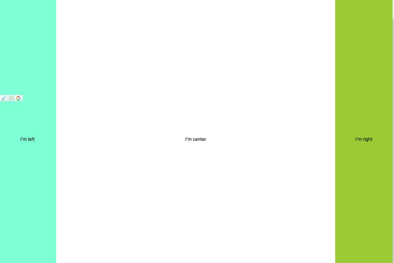
浮动布局
<html>
  <head>
    <style>
      /*浮动布局*/

      aside,
      article {
        height: 100vh;
        text-align: center;
        line-height: 80vh;
      }

      .left {
        width: 200px;
        background-color: aquamarine;
        float: left;
      }

      .right {
        width: 200px;
        background-color: yellowgreen;
        float: right;
      }

      .center {
        width: 100%;
      }

      header,
      footer {
        height: 80px;
        background-color: burlywood;
        width: 100%;
        text-align: center;
        line-height: 80px;
      }
    </style>
  </head>
  <body>
    <div className="app">
      <header>I'm header</header>
      <div className="container">
        <aside className="left">I'm left</aside>
        <aside className="right">I'm right</aside>
        <article className="center">I'm center</article>
      </div>
      <footer>I'm footer</footer>
    </div>
  </body>
</html>这种布局方式,dom 结构必须是先写浮动部分,然后再中间块,否则右浮动块会掉到下一行。 浮动布局的优点就是比较简单,兼容性也比较好。但浮动布局是有局限性的,浮动元素脱离文档流,要做清除浮动,这个处理不好的话,会带来很多问题,比如父容器高度塌陷等。 Demo
绝对定位布局
<html>
  <head>
    <style>
      aside,
      article {
        height: 100vh;
        text-align: center;
        line-height: 80vh;
        position: absolute;
      }

      .left {
        width: 200px;
        background-color: aquamarine;
        left: 0;
      }

      .right {
        width: 200px;
        background-color: yellowgreen;
        right: 0;
      }

      .center {
        left: 200px;
        right: 200px;
      }

      header,
      footer {
        height: 80px;
        background-color: burlywood;
        width: 100%;
        text-align: center;
        line-height: 80px;
      }

      footer {
        position: absolute;
        bottom: 0;
        top: 100%;
      }
    </style>
  </head>
  <body>
    <div className="app">
      <header>I'm header</header>
      <div className="container">
        <aside className="left">I'm left</aside>
        <article className="center">I'm center</article>
        <aside className="right">I'm right</aside>
      </div>
      <footer>I'm footer</footer>
    </div>
  </body>
</html>
绝对定位布局优点就是快捷,设置很方便,而且也不容易出问题。缺点就是,容器脱离了文档流,后代元素也脱离了文档流,高度未知的时候,会有问题,这就导致了这种方法的有效性和可使用性是比较差的。 Demo
flexbox 布局
<html>
  <head>
    <style>
      /*flexbox布局*/

      .container {
        display: flex;
      }

      aside,
      article {
        height: 100vh;
        text-align: center;
        line-height: 80vh;
      }

      .left {
        width: 200px;
        background-color: aquamarine;
      }

      .right {
        width: 200px;
        background-color: yellowgreen;
      }

      .center {
        width: 100%;
        flex: 1;
      }

      header,
      footer {
        height: 80px;
        background-color: burlywood;
        width: 100%;
        text-align: center;
        line-height: 80px;
      }
    </style>
  </head>
  <body>
    <div className="app">
      <header>I'm header</header>
      <div className="container">
        <aside className="left">I'm left</aside>
        <article className="center">I'm center</article>
        <aside className="right">I'm right</aside>
      </div>
      <footer>I'm footer</footer>
    </div>
  </body>
</html>
算是比较完美的方案,唯一缺点就是 IE10 开始支持,但是 IE10 的是-ms 形式的。 Demo
Grid 布局
<html>
  <head>
    <style>
      /*grid布局*/
      .container {
        display: grid;
        grid-template-columns: 200px auto 200px;
      }

      aside,
      article {
        height: 100vh;
        text-align: center;
        line-height: 80vh;
      }

      .left {
        background-color: aquamarine;
      }

      .right {
        background-color: yellowgreen;
      }

      .center {
        width: 100%;
      }

      header,
      footer {
        height: 80px;
        background-color: burlywood;
        width: 100%;
        text-align: center;
        line-height: 80px;
      }
    </style>
  </head>
  <body>
    <div className="app">
      <header>I'm header</header>
      <div className="container">
        <aside className="left">I'm left</aside>
        <article className="center">I'm center</article>
        <aside className="right">I'm right</aside>
      </div>
      <footer>I'm footer</footer>
    </div>
  </body>
</html>
也算是比较完美的方案了,只是兼容性不好。IE10+上支持,而且也仅支持部分属性。 Demo